How I animated my background ‘gradient circles’ on scroll with no performance impact ⚡️
Scroll event listeners are the worst... but we love scroll animations, so how did I animate my background ‘gradient circles’ ⭕️ with no performance implications
Today we’ll be running through how I created and animated the gradient circles used across the JP Development site without any frontend performance impacts.
Before we get into any great depth about animation and performance, let’s start out by taking a look at how went about building these ‘gradient circles’. My development site was created using React, but to start with let’s just create our circles in plain HTML and give them some styles with Sass (because who writes plain CSS any more).
Building our static gradient circle
We only need a single span element to create our entire circle:
<span class=“circle”></span>
Next let’s create our styles - there’s a few approaches to achieve this gradient border effect. For my UI design we’re not worried about the centre of the circle being transparent so this makes things a bit easier.
First, we’re going to styles the span element itself - making it round and applying a linear-gradient background:
Resulting in a ‘layered’ circle that looks a like this:
Gradient circle with ::before pseudo element applied
To make this more flexible I’ve created a React component in my project called Circle.jsx which allows a bunch of different properties to be passed in. These include the height, width and thickness of the circle, variant classes that change the circle’s appearance (including a version without a gradient border) and its absolute position values for placement on the page.
The <Circle /> component is then rendered in a few places in the project and looks a bit like this (we’ll use the id selector to apply our animation later):
In the previous section we created our <Circle /> React component and it’s ready to be added to any of our views/page sections.
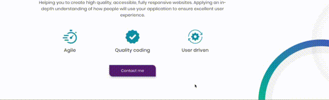
For this example, we’ve added our <Circle /> component to another React component <Promotion /> that builds out our ‘Promotion’ section. This section contains a couple of other static grey circles, a heading, descriptive paragraph, an icon list and a CTA:
Promotion section with circle component area highlighted
The behaviour we want to add is: ‘When the user scrolls forward or backwards through the Promotion section, rotate the <Circle /> by a certain amount’.
The aim is an effect where the border gradient colours appear to fade into each other as the user scrolls. Just to make things feel a bit more interactive.
Performance is key
There’s an approach that will probably spring to mind; create an event listener for when the user scrolls on the page. Maybe this event listener fires a function that increments the deg value for an inline style of transform: rotate(0deg). This would absolutely work in theory.
However, scroll events listeners are generally a really bad idea as they fire rapidly whenever the user scrolls. This can cause some pretty horrendous page performance issues.
We could maybe combat this with event throttling so the event fires less often on scroll, but this is still not the most performant approach that I’ve come across.
I’ve recently delved into the world of frontend animation and come across an incredible library of animation tools provided by GreenSock. They provide a package that is perfect for our needs and has an almost negligible performance impact on our page. The package is called ‘ScrollTrigger’.
Implementing GSAP ScrollTrigger
Note: The following steps assume you’re running a React project and uses jargon as such.
Step 1
Install the following package in your project with a package manager of your choice (I’m using NPM):
npm i --save gsap
Step 2
In our <Promotion /> react component where we’ve rendered the gradient circle we wish to animate, we need to add the following imports:
When the <Promotion /> component renders on the page we want to run an animation function called ‘handleAnimation’. We’ll write this function in Step 4 to initialise our ScrollTrigger package and apply our desired animation effect. For now let’s just import useEffect and create our hook to run our animation function on component mount:
Let’s break this function down a bit. First, we initialise our ScrollTrigger plugin so our component understands references to scrollTrigger:
gsap.registerPlugin(ScrollTrigger);`
Next, we tell gsap which element we want to apply the animation to, in this case we’re using the id of our <Circle /> component.
We then pass a few config options to scrollTrigger, in this case we have a trigger of #promotion-circle. This means the animation will only apply when the <Circle id=“promotion-circle” /> component is visible in the viewport.
You can read a bit more about these values in the ScrollTrigger documentation, we’re only using a few here and ScrollTrigger can be used for so much more than basic rotation.
We also pass in a rotation value of 720 which essentially sets a limit on how much we want to rotate our circle within our defined scroll area.
That’s all there is to it!
The result
We’ve created a simple but effective scroll animation for our gradient circles that makes the page feel a bit more interactive and fun without any negative performance implications.
I wish all animation was this straightforward! 🚀
What other people say
Other peoples’ opinions matter. I have worked with many people over the years and think it is important to share their experience of working with me.
Testimonial - Luke Canvin
James is a passionate and professional developer with a keen attention to detail and deep understanding of his field. His frontend experience, clear guidance, and knowledge of accessibility guidelines and best practices have proven extremely valuable.
Luke Canvin
Product Manager, Oxford Computer Consultants
Testimonial - Steve Denning
James has always been a safe bet to resolve issues surrounding projects, even lending a helping hand to other areas to widen his skillset and learn new technologies. I would have no doubt in recommending James for a position, an absolute pleasure to work with.
Steve Denning
Senior React Developer, This is ONE
Testimonial - Paul Sandwell
James is never afraid to try new approaches and is always eager to learn new techniques in the ever-changing world of web development. He is a valued asset to the team, and I am always keen to have him involved on my projects.
Paul Sandwell
Software Engineer, CGI
Testimonial - Nick Mustoe
Eager to get involved and quick to pick up where others had left off. James has a great eye for detail. I'd happily work with James again and wouldn't hesitate to recommend him.
Nick Mustoe
Senior Project Manager, PharmiWeb Solutions
Testimonial - Alex Deredas
Working with James for over 5 years in this area, he has shown great determination and is always willing to produce new fresh ideas. With a keen eye for detail and the ability to improve on key areas I would highly recommend him.
Alex Deredas
Senior Technical Analyst, Gresham Tech
Testimonial - Jeff Eng
James was dedicated and was eager for a challenge, especially his outside the box attitude. Not only did he gain the insight and know-how but applied and passed the knowledge to others within the team. I regarded James as an important asset to team accomplishment.
Jeff Eng
Technical digital professional
React Development
Tried and tested React application development. From super-fast single page applications to efficient large-scale corporate websites.
High-quality Templating
Experienced approach to coding consistent and maintainable frontend templates and component libraries.
Accessibility Implementation
Deep understanding of website accessibility, accessibility consultation, practical design, development, and testing experience.